How To: Get Back Avatars in Chrome to Switch User Profiles More Easily

Get Back Avatars in Chrome to Switch User Profiles More Easily

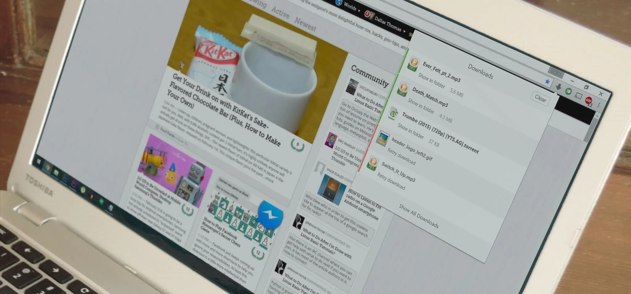
A recent update to Google Chrome replaced the colored avatar menu in the top-left (Windows) or top-right (Mac) corner of the browser that let you easily switch from profile to profile with a plain gray button that simply names what profile you're in.

I use different user profiles to manage my work and personal life in Chrome, and I had gotten very used to looking at the color and shape of the avatar picture as a means of quickly identifying what profile I'm in. Plus, if you want to open another profile in a new window, you could just hit the avatar and select another profile.
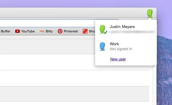
The old profile management UI, with the colorful avatar instead of the name.

The new profile management UI replaces the avatar with a simple gray button with the name of the user in it, which makes it slightly more work to tell which profile you're in, because instead of just looking at the colors, you have to actually read the name.
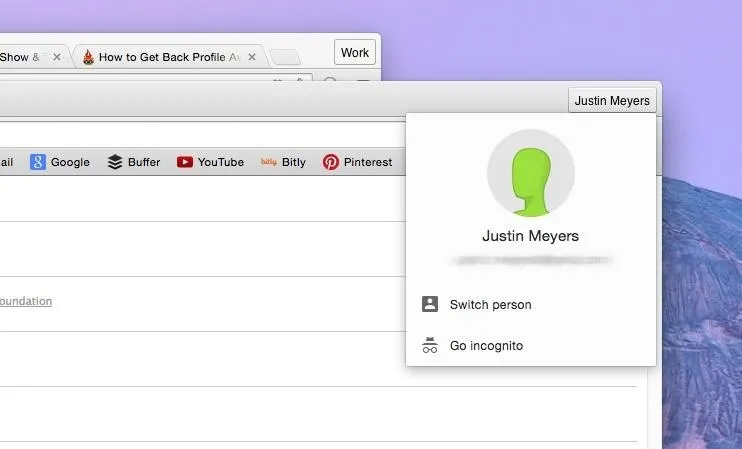
The new profile management UI in Chrome which uses a gray button.

Also, when you click on the name, instead of being able to immediately open another user window, you have to click on "Switch person" to open a popup where you would then select the other user.
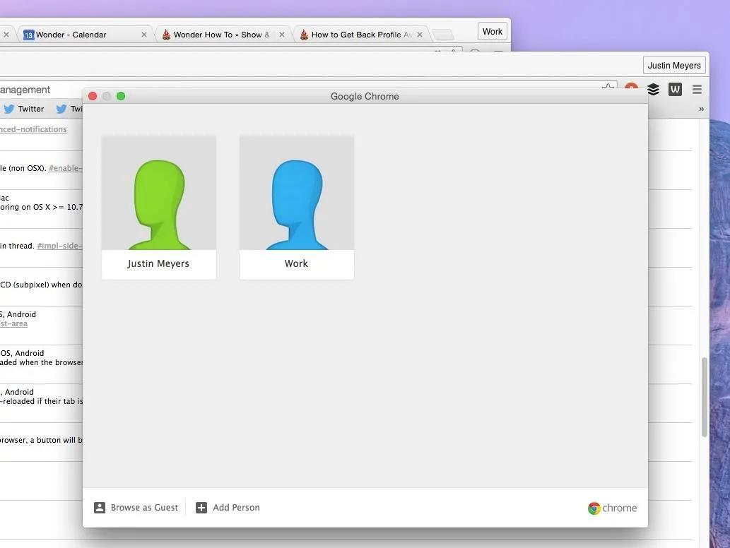
The new popup window after selecting "Switch person" in the menu.

How to Switch Back to the Old Avatar Menu

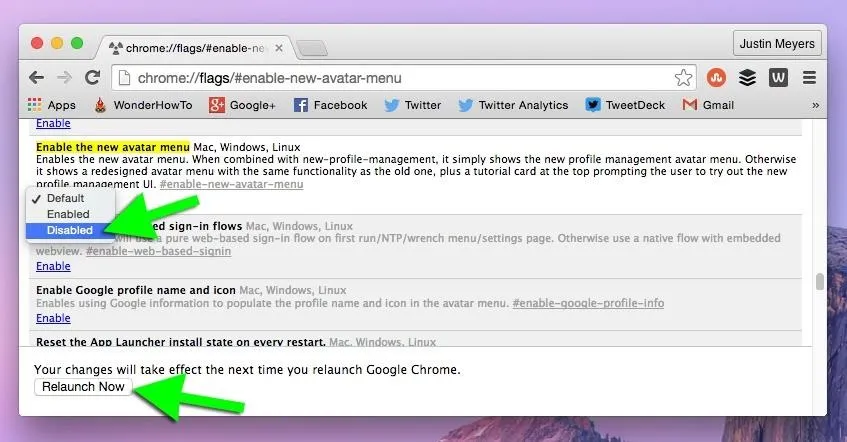
If you like the old profile management avatar menu like I do, it's easy to switch back using the Chrome Flags menu. Just go to chrome://flags/#enable-new-avatar-menu, disable the feature, and relaunch Chrome. Alternatively, you can do the following:

  1. Visit chrome://flags in the URL address box
  2. Search for "Enable the new avatar menu"
  3. Switch from "Default" to "Disabled"
  4. Hit the "Relaunch Now" button
Disable "Enable the new avatar menu" and relaunch Chrome.

After your browser relaunches, you'll see your normal colored avatars in the top-left (in Windows) or top-right (in Mac OS X), in which it takes only two clicks to switch profiles (vs. the newer three).

Update: 7/22/2015

The newest version of Chrome removed the "Enable the new avatar menu" flag, so you can no longer use it if your browser was automatically updated. The option below to disable the "new profile management system" also won't work to return the old-style avatars. However, despite the fact that we are stuck with the gray text boxes up top, they did incorporate an easy way to switch users. Just right-click on the username and you can see your profiles (with old avatars).
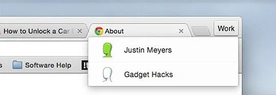
Right-clicking on the gray profile name to see the profile switcher.

How to Disable the New Profile Management Completely

Alternatively, instead of disabling the new avatar menu, you could disable the entire "new profile management system" (chrome://flags/#enable-new-profile-management), which has the same effect. It also disables the ability to lock profiles for guest use, as does the above option.

How to Switch Users Faster in the New Avatar Menu

If you don't mind the newer gray buttons, but still want a faster way to switch users, then you can keep the new profile management system and the new avatar menu while also enabling "Fast user switching in the avatar menu" (chrome://flags/#enable-fast-user-switching). This will make switching profiles one less click. However, you still get the boring gray buttons up top, but you will get the ability to lock profiles back.

To Reiterate:

For simplicity, "new profile management system" is NPMS, "new avatar menu" is NAM, and "fast user switching in the avatar menu" is FAST.

  • Only NPMS + NAM enabled = gray buttons; switch person and lock option in drop-down (no user list in drop-down)
  • Only NPMS + FAST enabled = color avatars; user list in drop-down (no switch person or lock option in drop-down)
  • Only NAM + FAST enabled = gray buttons; user list in drop-down (no switch person or lock option in drop-down)
  • Only NPMS enabled = color avatars; user list in drop-down (no switch person or lock option in drop-down)
  • Only FAST enabled = color avatars; user list in drop-down (no switch person or lock option in drop-down)
  • Only NAM enabled - gray buttons; switch person in drop-down (no user list or lock option in drop-down)
  • All three disabled = color avatars; user list in drop-down (no switch person or lock option in drop-down)
  • All three enabled = gray buttons; switch person, user list in drop-down, and lock option in drop-down

The only thing I really liked about the new profile menu is that you can easily switch to incognito mode, but the keyboard shortcut (CTRL+SHIFT+N in Windows; COM+SHIFT+N for Macs) is still pretty easy for me.

If you don't like the new-stye Bookmarks Manager, there's a way to revert back to the old Bookmarks Manager, too!

Just updated your iPhone to iOS 18? You'll find a ton of hot new features for some of your most-used Apple apps. Dive in and see for yourself:

22 Comments

Super nice

Thanks for sharing! Generally, I don't like to switch back to old stuff... I embrace updates, but this one really isn't well thought out. It takes too much time to switch between profiles. The only thing I liked about the new profile management UI is the guest feature. I used to create a bunch of profiles just to login temporarily to an account or to see how one of my social networks looked like as a guest.

Wonderful. I hated the new change that required more mousing

Thank you for this. Sometimes Google needs to learn to not fix what ain't broke.

Now, is there any chance of a workaround for that awful Google Hangouts in Gmail? Please bring back the "Call Phone" feature to Gmail running Google Chrome 64-bit! I have temporarily "reverted back to the old chat", but I'm sure that will go away eventually. It's a game changer for me.

Thank you. I'm glad Google left this as an option to the user. Hopefully they don't suddenly remove the flag one day.

...and it's gone.

Somehow, the setting has stuck on my Chrome install on my work PC even through updates, but on my home PC now where it hasn't been disabled, I cannot change back. :/ Damn you, Google.

Thanks for this awesome post!

I became hooked onto this feature because it was so quick to switch profiles. Had a lot of pain with the new implementation and extra click since I used the feature a lot. Glad to see the option was still there under the covers :)

The current chrome beta seems to have removed the ability to switch back. A big pain for me as the new interface cannot show all my users :-(

Ditto... This appears to be another reverse-direction Google development. If there is one thing about Google, they are consistent... Consistently removing streamlined approach for clumsy approach, that is. What seems clear is the Chrome development team's sense of complete autonomy and freedom to make completely arbitrary design decisions that negatively impact user experience. Why? I believe it could be as simple as that notorious line from Cool Hand Luke: "What we have here is a FAILURE to COMMUNICATE"... It could also be an inherent lack of developer-user empathy.

You can still get to the "old" menu by right clicking a user name in the top right. Not as nice as the old avatar display, but good enough, i guess ;-)

Omg thank you so much. It is perfect! I hated how even chromium now change the menu. Your comment saved me from having multiple pinned google windows on my start bar!

I haven't found a way to DISPLAY the icons any longer.

The newest update to Chrome removed the option to revert back. There is no longer a flag for "Enable the new avatar menu." Instead, you'll have to do the right-click a user name in the top right to see all of your avatars like Brad said above. I'm not fond of it, because I like telling my windows apart (I use at least 3 profiles simultaneously every day) visually, not by reading them. Colors vs. text were better. :/

I'm right there with you. It's too bad they have to force this change upon everyone.

This is a horrible design regression and is so frustrating! Icons are so much easier to differentiate using your peripheral vision, please add the option for them to be alongside the text. Additionally, the Command/Control+Shift+M shortcut now is basically useless for switching between profiles because you have to go through the "Switch Person" dialog to do it. What was 3 or 4 keyboard presses before now is more like 10. Since I probably switch profiles almost 100 times a day this feature now forces me to keep switching between my keyboard and mouse.

This is really bad HCI in version 44.0.2403.89 (July 22, 2015) where they retired the option. Why did Google introduce such a poor implementation of user switching and retire a feature that was more usable, easier and more useful?

It seems to me that google makes poor quality choices when it comes to good Human Computer Interaction changes

This is fundamentally a step in the wrong direction.

It's soooooooooooooooooo annoying. WHY would they remove features I don't want to have to right click ** that!

I just found this in the comments to the release note of Chrome:

"You just need to right click on the Chrome shortcut > "Properties" > "Shortcut" then add --disable-new-avatar-menu to the right of the "Target" attribute. In my case it became "C:\Program Files\Google\Chrome\Application\chrome.exe" --disable-new-avatar-menu"

This worked for me (on Windows) - just adding it to one shortcut made it work for all of the profiles accessed from the browser that spawned.

I can not get used to the grey buttons...on big screens I can not see which user/window I want. I reverted to an old bypass: using Chrome themes to "colorcode" my users. The "Simple red" or "Simple blue" style themes work best (only change the browser color)

I too am frustrated by this latest change that completely disables the avatar images. However, I do have a tip to share that at least allows you to get some color in that area so you can easily visually distinguish between your profiles (the main value to me of the large color avatars, easily being able to tell between my work email and my personal email, etc).

The trick is that the name field for your user in Chrome allows Native UTF-8 emojis to be pasted in, and displays them properly. If you cut and paste any of the emojis from the first column here http://apps.timwhitlock.info/emoji/tables/unicode you will be able to add those into the text for your name and see them there. Not a perfect solution but certainly better than plain text on a gray background. Hope this helps some folks!

Hm, doesn't seem to work for me. It just pastes in as the placeholder rectangle.

I switched from firefox to chrome for exactly same reason: mozilla got carried away with making crazy changes to the UI, completely ignoring the userbase. I take it that google really wants people to try out Edge browser now.

Share Your Thoughts

  • Hot
  • Latest