Chrome has been pushing out a lot of new changes lately, but not all of them are as good as they think they are. Earlier this year, there was an update that changed how user profiles worked, which made it harder to actually switch profiles. Luckily, there was a way to get back the old profile management interface, but now there's another "improvement" that you might want to change—Chrome's new Bookmarks Manager interface.
The actual Bookmarks Manager looks way different, focusing on boxes and colors that are hard to focus on and read. There is an obvious difference between folders and webpages, but it's not that obvious because of the colors and box shapes, especially if you have a ton of folders and webpages.
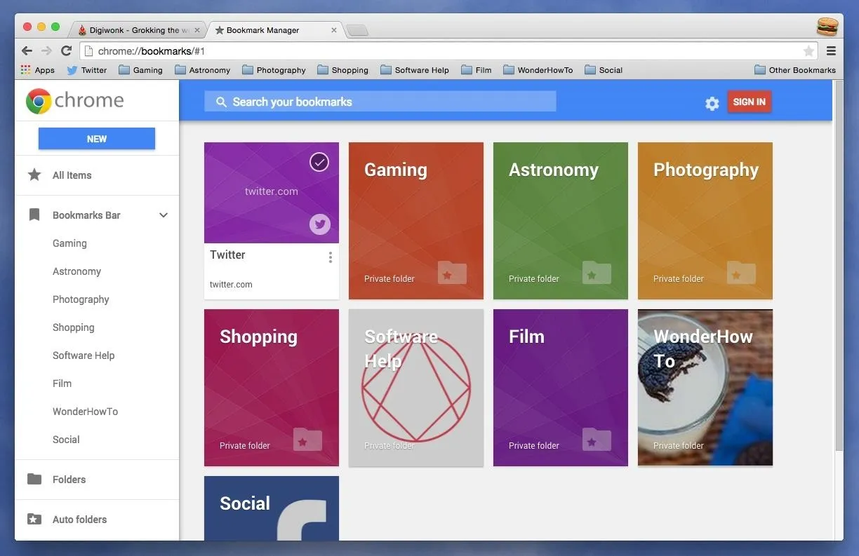
The new system: a harder-to-read, color- and box-based navigation menu.
For those who use the Bookmarks Bar a lot, the new update to the Bookmarks Manager is a step in the wrong direction. Now, whenever you click on the star icon in the right side of the address bar, the page is automatically bookmarked and added to "All Items" in the Manager, as well as a new folder in the Bookmarks Bar called "Other Bookmarks."
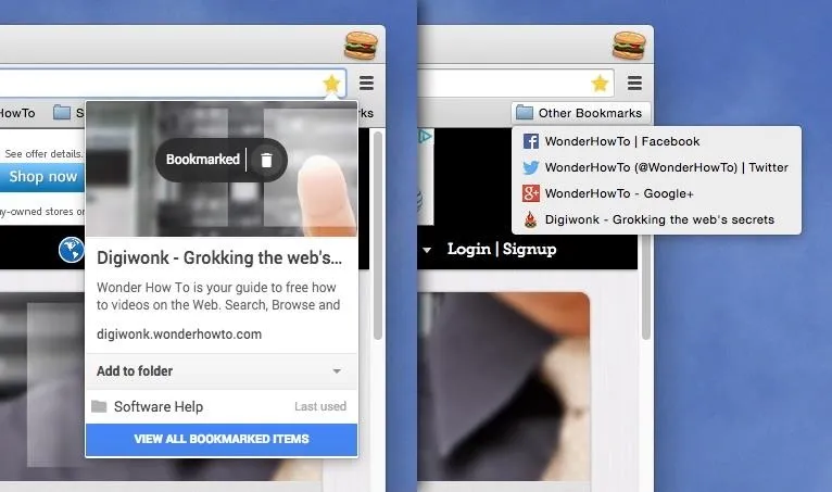
The new system: using the star to bookmark a page, which goes into "Other Bookmarks."
If you like to stay organized, you can choose to move the webpage into a new or existing folder in your Bookmarks Bar, but it's a little exhausting to do so if you have sub-folders.
The new edit bookmarks panel recommends the last folder used, which is hardly what you want, and navigating to another folder is awkward since you have to use the arrows as opposed to clicking on the name itself. Also, the folders are in alphabetical order, not how they're ordered in the Bookmarks Bar itself.
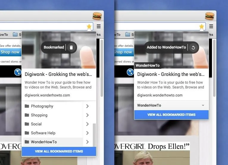
The new system: It's hard to navigate through folders and subfolders.
You can still right-click on the Bookmarks Bar to add a new webpage, which will give you an easier way to organize new bookmarks, but if you want the simpler Bookmarks Manager back, there's a way to revert.
Update: June 9th, 2015
Thankfully, Google has decided to bring back to the old Bookmarks Manager as the default one. You should see the old version come back to your Chrome browser shortly. If not, you can still use the instructions below until you do. And if for some reason you actually like the newer Bookmarks Manager above, you can install it from the Chrome Web Store.
How to Switch Back to the Old Bookmarks Manager
Reverting back to the old Bookmarks Manager interface is as simple as it was for reverting back to the old user profiles—using a Chrome Flag. Just go to chrome://flags/#enhanced-bookmarks-experiment, disable the feature, and relaunch Chrome. Alternatively, you can do the following.
- Visit chrome://flags in the URL address box
- Search for "Enable Enhanced Bookmarks"
- Switch "Default" to "Disabled"
- Hit the "Relaunch Now" button
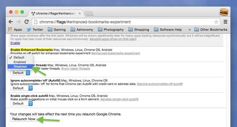
Disable "Enable Enhanced Bookmarks" and relaunch Chrome.
After your browser relaunches, the old star-based bookmark interface for adding new webpages to your Bookmarks Bar (or wherever) will return. Note that this change will affect all of your user profiles in Chrome, not just the one you're currently using.
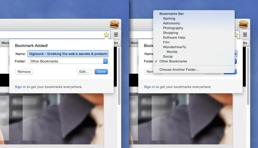
The old system: Simple is better; no confusing navigation; bookmarks arranged in order.
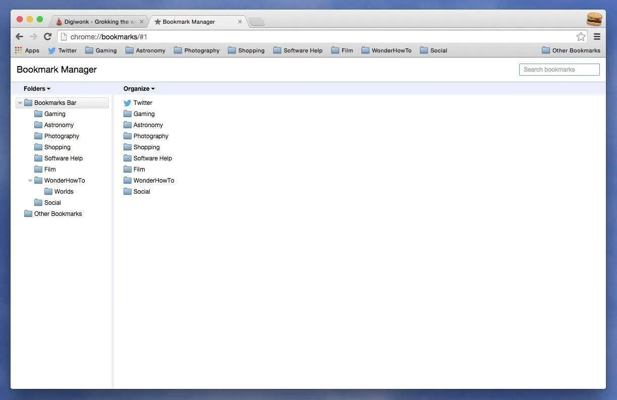
Additionally, the actually Bookmarks Manager will looks normal again, with its file-based structure that's easy to see and read. No more getting lost in bright colors and huge boxes.
Which system do you like better? The older Bookmarks Manager or the newer version? Personally, I'm never going back to the new one because I use the star icon as my go-to for adding things to the Bookmarks Bar, and I'm used to the old-style process.










Comments
Be the first, drop a comment!